Web Site Design Process

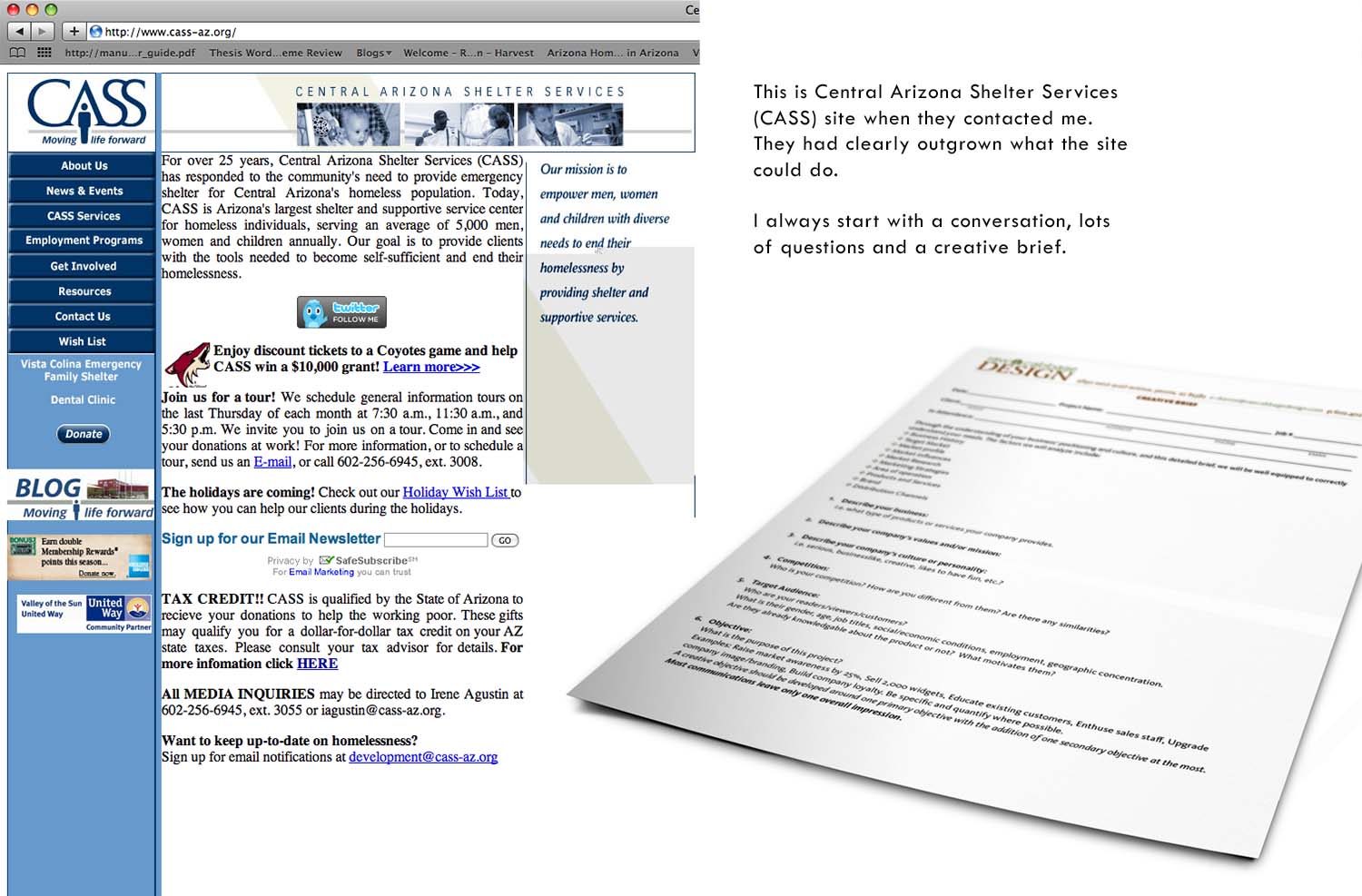
Original Site

Colors and Site Map
I discovered that first and foremost CASS wanted to let people know that they offered the homeless several programs beyond just their shelter. I decided color coding the individual programs to coordinate with the core colors (blue and red) would help people navigate through all the information. I used the colors to help the viewer recognize which section they were in. Also keeping in mind the colors could translate into other marketing vehicles when talking about the individual programs.

Design Options
I then provided CASS with three options and a description of how the pages might navigate.

